top of page


The new version of The 100 is a commemorative edition that reimagines the book with a highly illustrative and contemporary approach.
Project type
Programs
Local
Editorial
Layout
Illustration
In Design
Illustrator
Procreate
Photoshop
Belo Horizonte
Academic project developed at FUMEC University.


CONCEPT
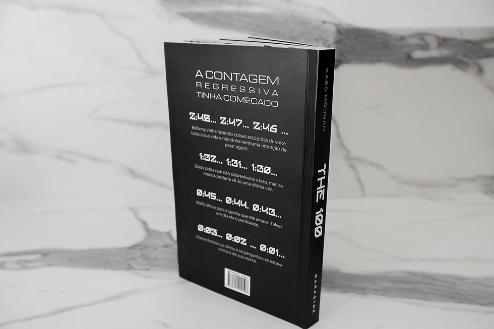
The 100: The Chosen Ones is an academic publishing project that proposes a graphic redesign of Kass Morgan's book. The original edition had problems that compromised both the reading experience and the perception of the work: lack of a consistent visual identity, typography unsuitable for the audience, and a layout that did not engage with the dystopian universe of the narrative.
The project started with this diagnosis to develop a complete new edition: cover, title page, internal layout, typography, and original illustrations. The visual design was guided by the genre and the target audience: teenage readers of science fiction, resulting in a cohesive graphic system that reinforces the tone of the story in every detail. Black and white, expressive illustration, typography with personality, and a clear grid structure define an edition that elevates the book to the level of its story.


The process began with a critical analysis of the existing edition , mapping out the points of failure and the elements that could be preserved or given new meaning.
The first generations of alternatives explored different visual directions, testing possibilities for cover art, typography, and internal structure. However, it became evident throughout the process that the initial solutions did not connect with the dystopian tone of the work; the result was visually generic and disconnected from the universe that the narrative constructs. This realization was decisive for a change of direction: the research delved deeper into the genre, the aesthetics of dystopian science fiction, and the visual references that resonate with a young audience. From this turning point, all subsequent decisions were guided by a clear narrative logic, where form and content build the same experience.


The black and white palette was adopted as a conceptual decision, as a tool. The stark contrast creates visual tension, reinforces the atmosphere of mystery, and highlights the illustrations without chromatic competition, allowing the expressive lines of the characters and the technical details of the environments to take center stage on the page.
The typography of the titles was chosen to communicate modernity and dystopia simultaneously, with forms that allude to systems, structures, and technology, directly engaging with the imagination of the teenage audience. In the body of the text, the typeface was replaced with an option that offers greater legibility and suitability for the age group, balancing the aesthetic experience with the functionality of continuous reading.


The grid structure defines the visual rhythm of the book and organizes the relationship between image and text consistently throughout the work. The left-hand page is reserved for the chapter opening illustrations, each accompanied by the narrator character's unique typographic signature, while the text occupies the right, creating a deliberate alternation between the visual and the narrative.
The internal illustrations follow the same alignment, maintaining the system's coherence. The internal margin has been widened to eliminate reading problems in the binding, ensuring comfort even on the thickest pages. The book's title has been incorporated into the pages as a continuous identifying element, a decision that reinforces the unity of the editorial object and the brand's presence throughout the entire reading experience.


bottom of page