top of page


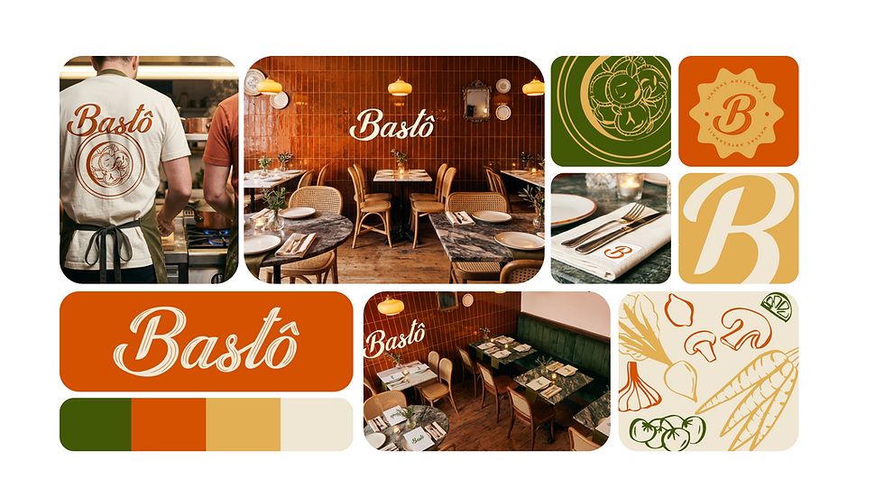
Bastô is where Italian tradition meets the flavors of Minas Gerais, offering handcrafted pastas that transform every meal into an experience.
Project type
Branding
Editorial
Illustration
Project developed within the Ouriço Agency.
Concept and mood board: Maria Eduarda, Nalu
Programs
Photoshop
Illustrator
Procreate
Local
Belo Horizonte


CONCEPT
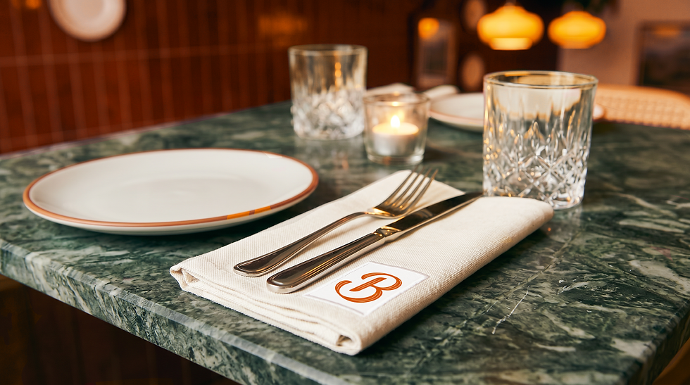
The concept of Bastô stems from a visual and sensory interpretation of Minas Gerais, where each color in the identity is more of an ingredient than an aesthetic choice. The orange comes from the Minas Gerais clay and tomato sauce; the green from the mountains and arugula; the yellow from fresh pasta and sunshine; the light beige from eggs and flour. The palette doesn't describe the brand, it savors it. The custom cursive typography was designed to appear light, fluid, and handcrafted, like the pasta itself that comes from the hands of those who make it.
The "B" in the logo was entirely designed to evoke pasta: the center of the symbol resembles penne, and the curve of the letter carries the lightness of pasta, being irregular. The logo, with its textures, uses these lines to further connect the brand to pasta. Bastô carries an accent, has weight and affection, and the identity translates this in every detail, from the typography's strokes to the color temperature, creating a brand that is Italian in tradition and from Minas Gerais in spirit.


bottom of page